Thursday, June 28, 2018

OKUDAGRAMS PART 4: SEVEN SECONDS THAT CHANGED EVERYTHING!

We can all point to some moment that forever changed our lives and set a direction for everything that followed. Getting married. Having kids. Seeing Wrath of Khan for the first time. Stuff like that.

For us Star Trek fans, there are seven crucial seconds that were filmed in 1986 that would quite literally affect  everything that would follow. I guarantee that no one else really thinks about it in that way, though. These seven seconds have been seen millions of times by millions of fans, and while it has always brought a smile to my face, until recently I didn't understand how critical these few brief moments really were to everything that would follow. 

Here's what I'm talking about. Start the clip below and go to 1:09 and watch the following seven seconds – 1:10 to 1:17.


Did you see it? No? Those seven seconds don't really seem to have that big of an impact outside of the story, right? Other than the crew getting a new Enterprise, what's the big deal?

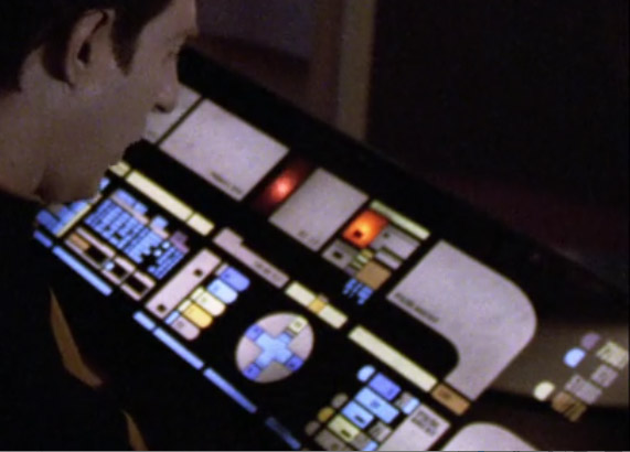
Plenty. Because those seven seconds show us what would become LCARS. They weren't called that, yet. But the panels we see on the bridge of the new Enterprise-A are the first of their kind in Star Trek history. They would definitely not be the last.

Let's back up a bit. In the early eighties there was as young graphic designer – who also happened to be a Star Trek fan – by the name of Mike Okuda. As we all know, Mr. Okuda would go on to fame by having screen credit on more Star Trek productions than anyone short of Gene Roddenberry himself. But these were early, pre-Trek days and Mike was trying to break into the business. In an interview with thespacereview.com, Mike put it this way:

"When the first two Star Trek movies came out, I noticed that the bridge of the refit starship Enterprise had video readout screens with round frames, rather than rectangular. They looked really cool, but I wondered why someone might have built round screens for a starship. I decided that it must have been because they were designed to display information that was circular in format, rather than rectangular.

For no good reason, I sketched up some ideas for graphics that might fit those round screens and for control panels that might work with that style.

On a lark, I sent some of those sketches in to Paramount, where they ended up on the desk of Ralph Winter, who was the associate producer on Star Trek III. Ralph telephoned me and told me that they were already staffed up on Star Trek III, which was just going into production at the time, but he said that he’d keep me in mind if they ever did a Star Trek IV. I was thrilled to get a call from Paramount, and I thought, “Gee, that’s the nicest brush-off I’ve ever gotten.”

Imagine my shock, when two years later, Ralph called back and said, “We’re doing another Star Trek movie. Would you like to work on it?”

That would be Star Trek IV: The Voyage Home (TVH), of course, and Mike would be tasked with doing something that few before him had ever done – design the controls for a starship called Enterprise.

It's important to note that Mike worked on several sets for TVH. For instance, he contributed the Klingon back-lit panels found on the revamped Bird of Prey:
I recently had the opportunity to ask Mike about the Klingon graphics and how he approached them:

"I loved the look of the Klingon animation in ST:TMP, so when I found the art for the Klingon lettering from that film, I used it as the basis for the backlit displays and signage in ST4 and beyond.


Those letters looked like they were based on the markings that Matt Jefferies designed for the wing of the Klingon Battle Cruiser in the original series."

So Okuda used the color scheme and animation from The Motion Picture to inform his new, expanded take on Klingon motifs. And, of course, they look a LOT like those dozens (hundreds?)  of Klingon panels to come over the next twenty years or so. And, though cool, it was more "evolutionary" than "revolutionary".

His work also appears in the Spacedock control room scene. Don't remember them? That's because they barely show up:
If you look sharply you can just make out some panels that seem to show, well...something. Here's what they look like close up.
Nice stuff but there's just not much there, there. So we go back to The Big Scene. The new Enterprise bridge:
Let's take a quick look at what had come before. This is more or less what the bridge looked like in the first three Trek movies (this is from Star Trek II):
We've got the round screens with animations that Okuda had noted. We also have a lot of switches and buttons. And blinky lights – let's not forget the blinky lights! Up to then, this was what the future looked like. This approach was an extension of the controls seen on the original series from the sixties.

Now compare this with this shot from the Star Trek IV bridge:
Same angle, same consoles but now with a totally different look and feel. Gone is everything physical. There's no raised buttons or switches, no blinky lights sticking out. It was literally like nothing that had come before! Here's another angle, this time a behind-the-scenes shot with the Roddenberrys themselves:
Note the sleek surfaces, the abstract presentation of information on flat panels. And not an actual keyboard in sight!

As with The Next Generation panels (which would come just a year later) these were driven by several factors, not the least of which was cost. The Star Trek IV production team was given a rather tough assignment: "give the world a new take on the Enterprise bridge – but don't blow the budget!"

It would only be on screen for seven seconds, after all. So here's what they did:

1. They reused the same bridge set from the previous films.

2. They painted that dark gray set white! It sounds kind of silly yet it worked really well. The stark difference in color was, well – stark!

3. They threw out all the old console controls. No buttons, switches or blinkys.

4. They replaced them with (drumroll, please!) the first Starfleet Okudagrams!
The actual design motifs created for the scene were so well received that they were fleshed out and expanded upon in the next several films:
The approach would also come to represent older ships throughout The Next Generation's run as with the Stargazer and Hathaway bridges:

So there you have it. Mike Okuda gets to design the new Enterprise-A panels which leads to the Enterprise-D LCARS which gets continually finessed and updated through the production of three different Star Trek shows and four feature films. Those panels define the look of the twenty-fourth century like no other visual element can. That's quite a legacy for a graphic designer who drew up some ideas and sent them out with no real expectation.

And it all started with seven seconds of film. Nice work, Mike! Very nice!

LLAP

Don


Monday, June 18, 2018

OKUDAGRAMS PART 3: WHY THEY SEEM TO KINDA SORTA MOVE – BUT REALLY DON'T

This is the third in a series on "Star Trek's" graphic panels called "Okudagrams". Check out Parts 1 and 2 for the whole story.

In the first two parts of this series, I got into the history of Okudagrams and showed how they were constructed with the materials of the day.

That leaves one big issue, of course: how did so many of those panels move if they're just colorful pictures created on a static piece of film? The answer is – they didn't actually move. They just LOOKED like they moved. If you look closely you'll see that nothing actually moves, but rather there's some sort of lighting effect that gives a sort of iridescent shimmery moving quality to selected parts of some LCARS. For years I assumed there was some type of actual animation at work. I was greatly mistaken.

To clarify: I am not talking about the bits of actual animation which were added in post-production to help tell a given episode's story. Rather I am talking about the stationary, unmoving panels that could be seen throughout the show.

To explain, let's take a look at a real LCARS panel that was created for the episode "Chain of Command". This was a standard panel created using the techniques described in the last chapter. (Note: I have made some subtle changes so that this panel cannot be duplicated correctly and passed off for an authentic version. If you don't think people would try to do that, you've got to get out more). Here's the front:


Here's the back:


The back shows the usual stuff including the polarizing film that I referred to previously. Those are the very dark gray (almost black) areas. It is that polarizing film that gives the effect of movement.

So let's get into exactly what that means. Take a look at this clip from "Chain of Command". Go to 6:30 on the time code and you'll see a scene with Riker and Jellico  talking/arguing about the state of things. The topic at hand – the location of Captain Picard – is being shown on an LCARS panel at the bridge's Science Station 1. Notice how things pulse and glow. Some items turn off and on. Now if you really analyze what you are seeing, you'll notice that no objects actually move.


The way this is achieved is through the use of two layers of polarizing film – one that is attached to the back of the LCARS panel and another one inside the lightbox to which it is mounted. It's a weird bit of science that works very simply, if strangely. A few years back, a functioning Lightbox from the set of Deep Space Nine was sold at auction through Propstore. Here's the excellent description they gave of the process:

"Inside the light box, fluorescent lights sit behind a round polarized filter that spins via a belt. The  polarization of the lens sends the light out in different directions toward the LCARS panel which is covered with diffusion paper. Attached to portions of the diffusion paper are small polarized sheets. These sheets are patterned in a way that causes the LCARS panel to appear as though it has a moving display when the light from the spinning polarized filter hits them from different directions."

Here's an interior shot of the DS9 Lightbox that they sold:

Propstore photo
Notice that the box used florescent tubes which were by far the best way to illuminate large flat areas like an LCARS panel. Six tubes are seen. Imagine the heat build-up and this is only a single panel. The Enterprise-D Bridge and Engineering sets were covered with these babies. It must have given the AC a run for its money!

But the most interesting thing is the detail in the center:

Propstore photo
We can see an electric motor with a spindle but there's nothing apparently mounted to it. That is because the polarizing film is translucent and when back-lit it virtually disappears. It is only when it interacts with the OTHER piece of film that is on the LCARS back that anything happens.

Here's a great video that explains the interaction in a visual way. Things get very interesting at about the 2:00 mark:


Combine that knowledge with this video of the Propstore piece and you'll have a new understanding of the science and execution involved in the complete process. Keep in mind that there is a spinning disk on the inside, though it is virtually impossible to see it.


So the designers of a given LCARS panel decided what areas that they wanted to be "glowy/pulsy" (my new technical term for this effect) and selectively applied the film to the panel's back.  By utilizing this relatively low-tech gimmick for their panels, the Star Trek artists were able to bring life to what would otherwise be static (boring!) panels. And they avoided the need to use actual CRT screens showing live animation, a technique that was used in the films but one which was too expensive and time-consuming to use for a TV series. As screens got smaller and thinner, that approach changed. But throughout the run of The Next Generation, live screens were almost never used.

As an aside, apparently this polarizing film effect was used in the 50's 60's and 70's for various advertising and attention-getting purposes. I have no memory of ever seeing this in person, however.

This technique was used in NextGen and DS9 as well as Star Trek V, VI and Generations (though the films also added CRT screens to the mix). By the time we get to Star Trek: First Contact, the old school polarized film technique was gone. The LCARS were all video-fed screens from that point on as far as the Enterprise-E was concerned though some large panels were simply back-lit without the polarized effect. Deep Space Nine would continue their use while changing over as time went by. Voyager used back-lit panels but I'm not sure if they used the polarizing effect or not. It doesn't seem to be used but I'll need a little help from my friends on that topic to say for sure.

So that is how the whole shebang worked. My thanks to fellow LCARS enthusiast Ray Minarcik for pointing me to the Propstore auction, without which this story would not have been as complete. In the next chapter I'll be breaking down some key types of LCARS and how they were incorporated into the story-telling.

LLAP,

Don

Friday, June 15, 2018

OKUDAGRAMS PART 2: CREATING THE 24TH CENTURY WITH GAFFER TAPE AND CELLOPHANE

This is the second in a series on "Star Trek's" graphic panels called "Okudagrams". Check out Part 1 for the basics. 

NOTE: I am a graphic designer who started out in the 80's. In one of my first jobs I created color graphics for trade shows and industry meetings including overheads and slides shows. I used EXACTLY the same process that is described below so I am very familiar with this system. My stuff didn't end up on television, of course!

Data starts to realize that things aren't as they seem.
As all Star Trek fans know, in the twenty-fourth century, things are made of exotic materials such as transparent aluminum, duranium, tritanium, neutronium, and of course, Trellium-D. There are minerals like kironide and pergium (a favorite snack of the Horta, of course). And don't get me started on Protomatter or Omega Particles. Not. Good.

So with all that very-high-tech-sounding stuff, it might surprise you to find that the most sophisticated computer system interface of the day – LCARS (Library Computer Access and Retrieval System) – is actually made out of rather ordinary twentieth-century stuff. Film negatives. Plastic photographic colored gels. Some Plexiglass. Oh, and lots and lots of black gaffer's tape (like duct tape but different). Yeah, I said tape. All of these things were common to graphic designers of the day, so as a designer, creator Mike Okuda used the tools of the day to best achieve his goal: a visual representation of believable future technology.

Let me take a moment here to explain the huge difference between now and then as it pertains to the subject at hand. It's vital to understand that these panels were all created in the pre-digital age of the 1980's. Because of this, it would be virtually impossible to recreate these today using the same process because the basic products used (like the film and the camera used to shoot it) no longer exist. Today we'd fire up the computer and use a vector-based drawing program (I use Adobe Illustrator) to create perfect, crisp high-res files. We'd then shoot that file over to a high-end inkjet printer that printed on white translucent film. We could go from start to finish in just a couple of hours, depending on the nature of the panel. But back then everything was done with, to quote Spock, "stone knives and bear skins". It was all manual, it was all analog, it was very time consuming.

It sucked.

Let's take a look at exactly what I'm talking about. Here's a scene from Star Trek VI: The Undiscoverecd Country which featured panels made in the same way as the NextGen LCARS. Check our the panel that Kirk is looking at:
Here is the actual panel as it looks today:

If you look closely you can see that it is covered in a frame of black tape. But on-screen it looks so clean. What's up? Well, on-set the panels are mounted into their positions then covered with a large piece of dark gray plexiglass which makes any imperfections (like the tape) disappear while letting the backlit graphic shine brightly through. Regarding the tape, it is applied from the back. On the front we see the adhesive side through the clear plexi that everything is mounted to.

Here's what the back looks like:

We can see the black tape that frames the art area. But what's all that odd mix of stuff in the image area? First off, the image itself is on a piece of Kodalith film which was perfect for the job. It gave a totally opaque black (so no light could leak through or soften the image) and a perfectly clear positive area (so that the backlight would transmit through it perfectly). The blue and green stuff is transparent photographer's gels (used to tint lighting during a photo shoot). It was simply cut out and applied to the back of the film negative with 3M spray adhesive (a product I still use today as it still has its uses in a design studio). The various colors are placed to correspond with specific areas on the negative. The white-ish layer is a white translucent sheet used to diffuse the lighting. All of these layers are then attached with spray mount to the forward piece of clear plexiglass. The tape is used to mask any border areas that the film doesn't cover.  The very dark irregular areas in the midst of the image are what makes these very unique things. They are a polarized film that makes a very interesting effect. More on that later.

So – first things first. The very first step was to prepare black and white artwork. This would have been done with type being created on a phototypesetting machine and output to photo paper which was then pasted onto an artboard (yes, pasted!). The graphic area would have been drawn with a combination of pen (!!!) and black line tape. A negative would have then been shot which would have reversed the positive and negative areas – perfect for the high-contrast design of LCARS.

That negative was the foundation on which the finished panel was built. Here's a diagram that shows the different layers and how they came together to create a panel (click to enlarge):
All of these layers got sandwiched together to form each panel. On the early panels like this one, the film neg itself was sprayed with adhesive and permanently attached to the clear plexi. In later pieces, they figured out that they didn't need that step so in later NextGen examples, that plexi is not present.

This Next Gen LCARS is seen in "Descent" and "Interface":

Here's the actual panel as it sits on a lightbox. Notice it has no tape on its edge like the earlier piece and is not mounted to plexi:
 Here's the back:

You can see that the color was achieved in the same way as the first piece – colored gels overlaid on the negative (using spray adhesive) with a diffusing sheet over the whole piece. The dark areas are the same polarizing film as before.

So these pieces get mounted on the set over top of the backlight box, then get the dark plexi placed over them and – voila – 24th century technology at its finest!

This is how every single LCARS panel seen through the seven year run of Next Generation was made as well as much of Deep Space Nine. Any time actual animation appeared, it was added in post-production as a special effect. It was NEVER live on the set.

Here's a great shot of Mike Okuda with one of his creations before it was mounted on plexiglass. He seems to be holding one of the "keyboard" sections used on the rear bridge stations.


During the production of the early movies, the three lower panels were mounted as a single piece. Here's an engineering station lower panel:


These are all stuck directly to a single sheet of plexiglass. You can see the ton of tape used to mask the edges. The dark plexi would go over this to give a seamless, clean look. Here it is on-set:


So that is how the magic is done. Except for the polarizing effect that I mentioned earlier which is the REAL magic. What's up with that?

Stay tuned – that's up next time!

LLAP.

Don

Wednesday, June 13, 2018

OKUDAGRAMS PART 1: HOW ONE MAN DESIGNED THE FUTURE WE ALL LOVE

I recently purchased a number of original graphic panels that were used in the production of "Star Trek: The Next Generation". While researching them, I discovered that these pieces are truly works of art that were integral to the success of Star Trek in it's rebooted forms. I also rediscovered my love for the series, much of which I had not seen in many years. Both of those facts lead to this series of articles on the subject of these amazing bits of design.

Everyone knows that the original Star Trek was created by Gene Roddenberry. As creator and producer of the original series (1966-69) he is the acknowledged source of all things Trek. But, while the concept is the product of a single man, it's not an exaggeration to say that Star Trek itself is the product of thousands of creative people working to make that concept a reality on film. Costume designers, production artists, scenic designers, art directors – all had to come together to visually create the  fantastic future universe that we collectively know as Star Trek.

Star Trek designer Mike Okuda with an original Sickbay panel.
When we think of that rich visual presentation of Trek's various incarnations, there's one consistent element that acts as a unifying visual thread throughout all the various pieces and parts. That element is commonly called an "Okudagram". In short, Okudagrams are the interactive-looking control panels and surfaces that appear throughout Star Trek. They are named after their designer, Mike Okuda, a graphic designer who joined the Star Trek production world back in 1985 with the making of Star Trek IV: The Voyage Home. From that very humble start Okuda's work would go on to help define the very look of the Star Trek universe. On a personal note, as graphic designer myself, Mr. Okuda is one of my personal design heroes. His work has greatly influenced my own over the years.

LCARS panels cover every control surface of the Enterprise-D
Even casual viewers of Star Trek came to know these ubiquitous pieces of design because of the popularity of Star Trek: The Next Generation. The Enterprise-D is literally covered with them. Every control surface of the bridge, engineering, sickbay, the holodeck – you name it – all feature Okudagrams. Dubbed "LCARS" for Library Computer Access and Retrieval System, these panels became synonymous with the look of 24th century Starfleet technology. They would be seen not only on the Enterprise-D, but on every type of Starfleet facility – every ship, Starbase and outpost had them which gave an instant kind of recognition to these locations. Alien ships would get their own unique design treatments which would help define the visual worlds of the Klingons, Romulans, The Dominion and myriad other races. The style would be used faithfully throughout the runs of The Next Generation, Deep Space Nine and Voyager. Enterprise would get its own version of Okudagrams, one meant to convey an earlier use of the technology. Okuda was designing what would become known as a user interface, the now common term for screens on computers, pads and phones. But he was doing it thirty years ago!

Data's Ops station shows the LCARS interface.
At first glance the colorful graphic panels might be dismissed as simple set decoration that is used to convey a high-tech future. But, while it's true that LCARS do serve that function in many ways, they are so much more than mere ornamentation. Those panels are actually a refined story-telling device that help reveal countless details to watchers. They convey information that is key to zillions of plot lines in a way that is simple to understand and visually engaging while being uniquely Star Trek.

The original Star Trek's controls – lots of switches, knobs and blinky things.
In a 2010 article on arstechnica.com, Okuda explained why the controls looked so different from the original series' physical switches. "The initial motivation for that was in fact cost. Doing it purely as a graphic was considerably less expensive than buying electronic components. But very quickly we began to realize—as we figured out how these things would work and how someone would operate them, people would come to me and say, 'What happens if I need to do this?' Perhaps it was some action I hadn't thought of, and we didn't have a specific control for that. And I realized the proper answer to that was, 'It's in the software.' All the things we needed could be software-definable."

Okuda's sleek approach to interfaces began with the original cast movies.
And so, to keep things sleek, simple and elegant, Okuda designed touch-screens before anyone really knew what a touch-screen was. The implication was that the screen could dynamically change as the user interacted with it. Most of the time the panels could not be seen clearly so the idea worked perfectly. And instead of having to physically build a panel with all sorts of expensive details, Okuda designed a flat piece of art for each station. That would be translated to the pieces seen on-set in a process that was far more cost-effective than the traditional style of earlier years. And it beautifully fulfilled the need of looking futuristic.

In "Rascals" the crew gather in Engineering to ponder an LCARS image.
There's an old adage in film-making: show, don't tell. With the LCARS approach, that became simpler than ever. Instead of having a character stand in front of the others and tell them a piece of information, a custom panel could be designed for a specific episode that helped the characters to convey that information in a more interesting way. How many times did the characters gather around the bridge science station to get an update from Data? What about the numerous mission briefings in the conference room or in Engineering? Sometimes an actual animation was used but most often it was a simple, static image used to help things along.

Data and Geordi explain things in the conference room in "I, Borg".
Riker and Jellico argue in "Chain of Command".
Dr. Crusher is surrounded by LCARS in Sickbay.
The panels themselves were made with basic items of the day – film negatives, photo gels and plexiglass. But when assembled and placed on-set, the sleek, futuristic environment became alive with light and sound. I'll discuss the construction in detail in the next chapter.

Stay tuned!

LLAP,

Don